文章管理
本页讲解 posts/ 目录的组织方式,以及加密文章、转载文章、组件 demo 文章的写法约定。文章是博客的核心内容载体,本主题通过目录结构 + frontmatter 两个字段共同管理文章的身份与展示。
目录结构
本主题默认从项目根目录的 posts/ 文件夹读取文章(可通过 defineConfig 第三参数的 postsDir 自定义,详见 配置详解)。posts/ 下建议按内容类型划分子目录:
posts/
├─ articles/         # 普通文章(技术分享、经验总结)
│  ├─ bem-conventions.md
│  ├─ css-selector.md
│  └─ vue3-ref.md
├─ cheat-sheet/      # 速查表类文章
│  ├─ git-command.md
│  ├─ http-status.md
│  └─ steam-badge.md
├─ components/       # 组件 demo 文章(配合 vitepress-demo-plugin)
│  ├─ rotateButton/
│  │  ├─ RotateBorderButton.vue
│  │  └─ 基础用法.vue
│  └─ themeSwitch/
│     ├─ ThemeSwitch.vue
│     └─ 切换按钮.vue
├─ demo/             # 测试/示例文章
│  ├─ markdown.md
│  └─ test.md
├─ encrypted/        # 加密文章
│  ├─ 1437.md
│  └─ zsh-themes.md
└─ utils/            # 工具类文章(组件文档)
   ├─ rotate-button.md
   └─ auto-scroll.md
子目录可自定义
上表的子目录名是 demo 站点的约定,并非主题强制要求。你可以按自己的内容分类自由组织,例如 notes/、tutorials/。主题会递归扫描 posts/ 下所有 .md 文件作为文章。
不要把页面放进 posts/
posts/ 下的文件默认会被 getAllPosts() 收集,进入文章列表、归档、分类与标签体系。如果某个文件不想被当作文章(如速查表、工具页),请放到 pages/ 目录,或在 frontmatter 中设置 isPage: true。详见 文章与页面的区别。
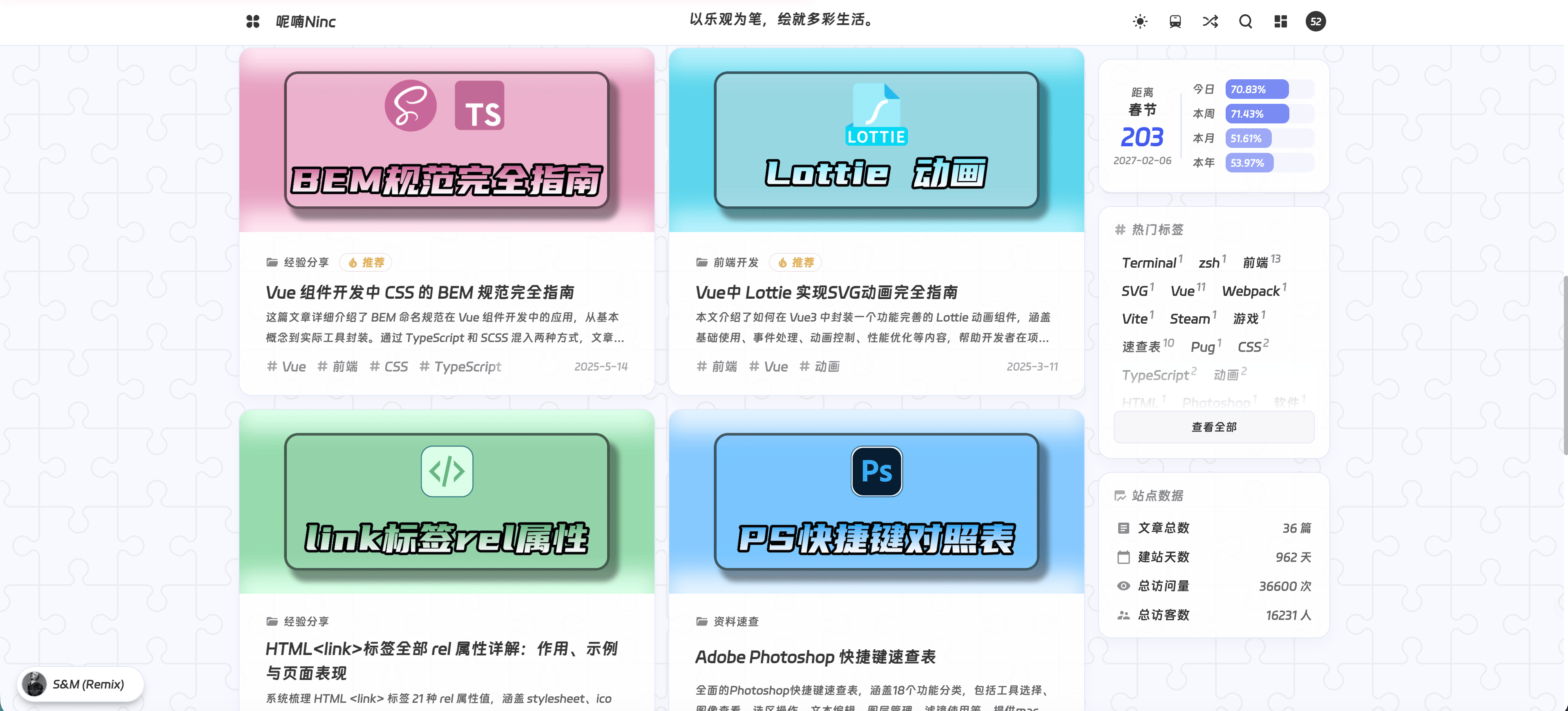
上图展示了首页文章列表的渲染效果,每篇文章以卡片形式展示,包含封面、标题、日期、标签与摘要。
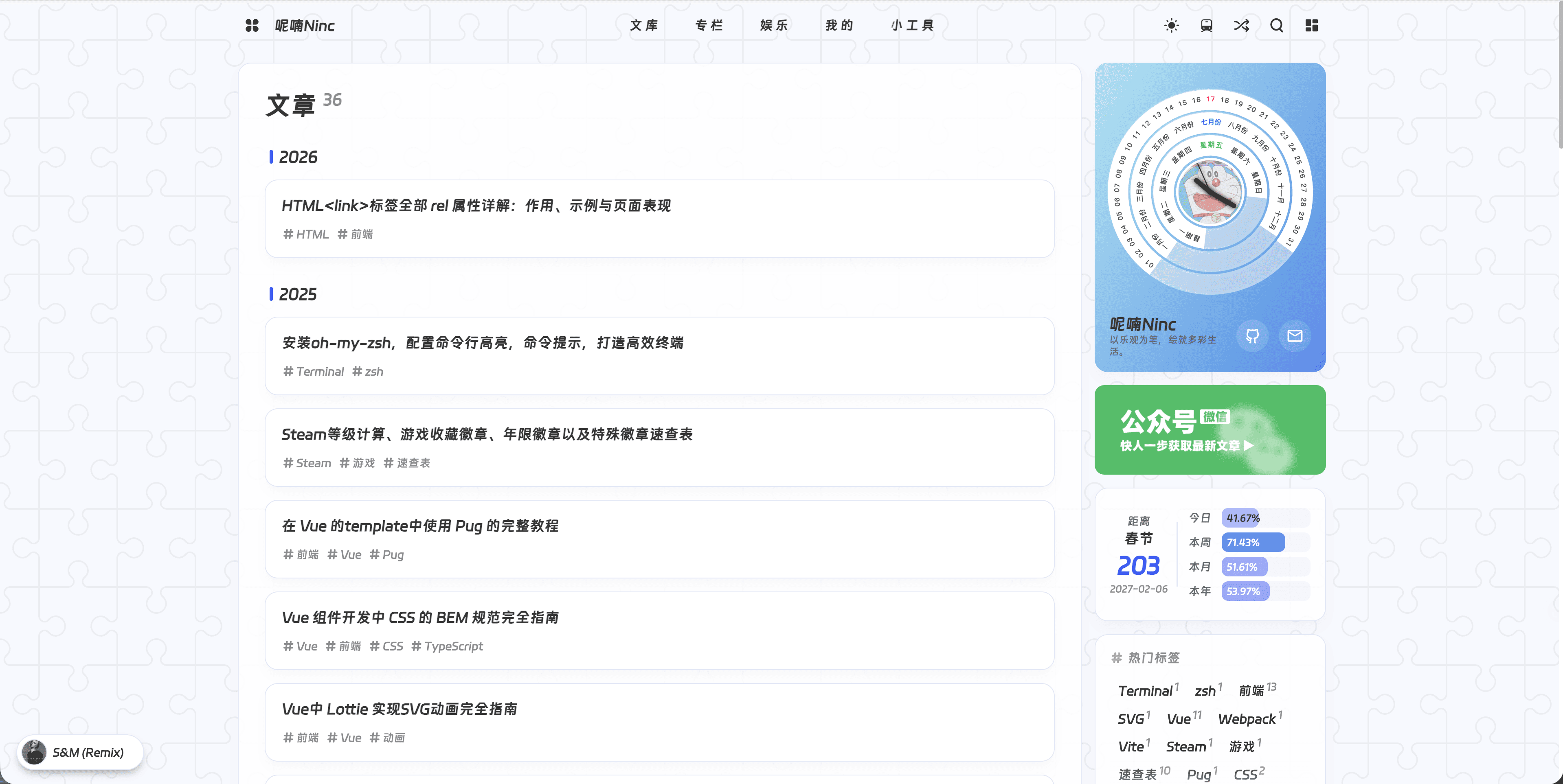
上图展示了归档页的渲染效果,按时间倒序列出全部文章。
文章 Frontmatter
每篇文章以 frontmatter 开头,声明标题、标签、分类、日期等元数据。完整字段表见 Frontmatter 字段。最简写法:
---
title: 我的第一篇文章
date: 2025-01-01
tags: [随笔]
categories: [开始]
---

# 我的第一篇文章

正文内容...
必填字段
title 与 date 建议必填。date 缺失会导致文章无法正确排序,归档页也会出现异常。
加密文章
不希望被陌生人随意看到的内容可放在 posts/encrypted/ 子目录,并通过 frontmatter 的 crypto 字段加密:
---
crypto:
  enable: true
  password: your-password
---
crypto 字段说明:
| 子字段 | 类型 | 说明 |
|---|---|---|
enable | boolean | 是否启用加密 |
password | string | 访问密码(frontmatter 中写明文,构建时转为哈希) |
完整的加密文章使用方式(含密钥文件创建、安全须知、访问流程、防暴力破解机制)见 写作工作流 - 加密文章。
转载文章
转载他人文章时,通过 frontmatter 的 reprint 字段标注原文信息。文章页会显示转载来源卡片:
---
reprint:
  title: 原文标题
  url: https://example.com/original
---
reprint 各子字段(title/desc/url/icon)的完整说明见 写作工作流 - 转载文章。
组件 Demo 文章
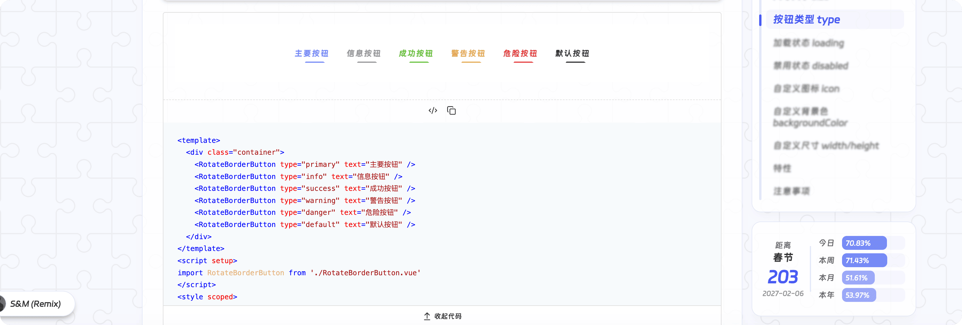
本主题集成了 vitepress-demo-plugin,可在 Markdown 中嵌入可交互的 Vue 组件示例,并支持查看源码。这类文章通常放在 posts/components/ 与 posts/utils/ 两个目录协同组织:
posts/components/<组件名>/:存放组件本体与各 demo 的.vue文件posts/utils/<组件名>.md:文章正文,通过<demo vue="..." />引用 demo
目录结构示例
posts/
├─ components/
│  └─ rotateButton/
│     ├─ RotateBorderButton.vue    # 组件本体
│     ├─ 基础用法.vue               # demo 1
│     ├─ 按钮类型.vue               # demo 2
│     └─ 禁用状态.vue               # demo 3
└─ utils/
   └─ rotate-button.md              # 文档文章
组件本体示例
RotateBorderButton.vue 是组件本体,被各 demo 文件 import:
<!-- posts/components/rotateButton/RotateBorderButton.vue -->
<template>
  <button class="rotate-btn" :class="[`btn-${type}`, `btn-${size}`]">
    <slot name="icon" />
    {{ text }}
  </button>
</template>

<script setup>
defineProps({
  text: { type: String, default: 'button' },
  type: { type: String, default: 'primary' },
  size: { type: String, default: 'default' }
})
</script>
Demo 文件示例
每个 demo 是一个独立的 .vue 文件,引入组件本体并展示某种用法:
<!-- posts/components/rotateButton/基础用法.vue -->
<template>
  <div class="container">
    <RotateBorderButton text="点击按钮" type="primary" />
  </div>
</template>

<script setup>
import RotateBorderButton from './RotateBorderButton.vue';
</script>

<style scoped>
.container {
  width: 100%;
  height: 100px;
  display: flex;
  justify-content: center;
  align-items: center;
}
</style>
文档文章示例
posts/utils/rotate-button.md 是面向读者的文档文章,通过 <demo vue="..." /> 引用 demo 文件,并展示源码:
---
title: 旋转边框按钮
tags: [通用组件, Vue]
categories: [通用组件]
date: 2024-12-25
mainColor: '#f3b0ab'
cover: /images/cover/rotate-button-cover.jpg
description: 本文介绍旋转按钮组件,阐述其基础用法,说明属性、插槽、事件相关内容。
articleGPT: 本文介绍旋转按钮组件,阐述其基础用法,说明属性、插槽、事件相关内容。
---

# 旋转边框按钮

> 一个具有旋转边框动画效果的按钮组件。

## 基础用法

\`\`\`vue
<RotateBorderButton text="点击按钮" type="primary" />
\`\`\`

<demo vue="rotateButton/基础用法.vue" />

## 属性说明

| 属性名 | 说明 | 类型 | 可选值 | 默认值 |
|--------|------|------|---------|--------|
| text | 按钮文本 | String | - | 'button' |
| type | 按钮类型 | String | primary/info/success | 'primary' |
| size | 按钮尺寸 | String | large/default/small | 'default' |
demo 路径前缀
<demo vue="..." /> 中的路径是相对于 defineConfig 第三参数 demoDir 的相对路径。默认 demoDir 为 <cwd>/posts/components,所以上例中 rotateButton/基础用法.vue 对应 posts/components/rotateButton/基础用法.vue。
如果你的 demo 文件放在其他目录,需要在 config.mts 中显式指定 demoDir:
// .vitepress/config.mts
import { defineConfig } from 'vitepress-theme-ninc/defineConfig'
import { themeConfig } from './themeConfig'

export default defineConfig(
  {},
  themeConfig,
  {
    demoDir: new URL('../posts/components', import.meta.url).pathname
  }
)
文章与页面的区别
文章(posts/)与页面(pages/)的核心区别在于是否进入文章体系:
| 特征 | 文章 (posts/) | 页面 (pages/) |
|---|---|---|
| 进入文章列表 | ||
| 进入归档页 | ||
| 进入分类页 | ||
| 进入标签页 | ||
| 默认显示侧边栏 | 视 frontmatter 而定 | |
| 典型场景 | 博客文章、技术分享 | 关于、留言、工具页 |
如果某篇 .md 文件放在 posts/ 但不想被当作文章(如速查表、工具型内容),可在 frontmatter 中设置 isPage: true,它仍可通过 /posts/... 路径访问,但不会进入文章列表。工具页完整使用指南见 写作工作流 - 工具页。
分页
文章列表的分页由 themeConfig.postSize 控制,它决定每页显示多少篇文章。例如设为 10:
// themeConfig.ts
import { defineThemeConfig } from 'vitepress-theme-ninc/defineThemeConfig'

export const themeConfig = defineThemeConfig({
  postSize: 10
})
分页路由由 page/[num].paths.mjs 在构建时生成,它会读取 themeConfig.postSize 计算总页数,并为第 2 页到最后一页生成路由参数。完整写法见 自定义页面 - 分页页。
修改 postSize 后的影响
postSize 变化会改变分页路由数量。若你从 10 改为 8,原来 /page/5 可能不再存在或内容会重新分布。这是构建期行为,无需手动维护。